

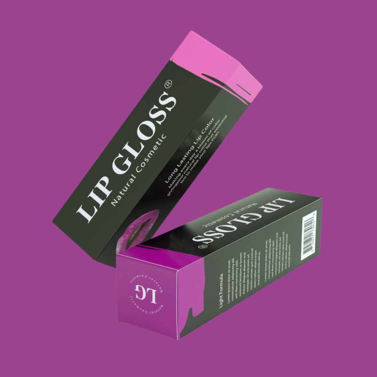
How Can I Make My Lip Gloss Box Logo Stand Out?
In the beauty industry, where countless products compete for attention on store shelves and online marketplaces, your packaging is your first impression. Among all the design elements on your custom lip gloss box, the logo is the most critical. It tells customers who you are, builds brand recognition, and communicates your values in a split second. But with so many brands offering lip gloss, how can you make your logo stand out? The answer lies in thoughtful design choices, strategic printing techniques, and a strong understanding of your target audience. https://customlipglossboxes.com/
Why the Logo Matters
Your logo isn’t just a decorative mark—it’s your brand identity condensed into a single symbol or word. A well-designed logo on your lip gloss box can:
-
Build trust and credibility.
-
Help customers recognize your product instantly.
-
Elevate your packaging from ordinary to premium.
-
Create a consistent visual identity across products.
If your logo blends into the background or feels forgettable, your packaging loses its power to captivate shoppers.
Design Strategies to Make Your Logo Pop
1. Choose the Right Color Palette
Color psychology plays a huge role in how your logo is perceived. For instance:
-
Gold, silver, or rose gold signal luxury and sophistication.
-
Bright pinks or purples appeal to fun, playful, youthful markets.
-
Muted neutrals suggest eco-friendliness or minimalist elegance.
The key is contrast. Your logo should stand out from the background color of the box. If your packaging is dark, consider a light or metallic logo. If your packaging is pastel, a bold, saturated logo can grab attention.
2. Typography That Tells a Story
If your logo includes text, the font must reflect your brand personality. Serif fonts can give a timeless, classic feel, while sans-serif fonts feel modern and clean. Handwritten or script fonts can make your lip gloss appear personal and feminine. The right typography makes your brand more memorable.
3. Use Negative Space Cleverly
Sometimes simplicity is the best way to stand out. Logos that use negative space or minimal shapes often look cleaner and more professional on packaging. A simple, well-spaced design can feel bolder than something overly complex.
Printing Techniques to Elevate Your Logo
A big part of making your logo stand out comes down to how it’s printed on the box. Here are some techniques to consider:
-
Foil Stamping: Metallic foils (gold, silver, holographic) instantly draw the eye and give your logo a luxurious finish.
-
Embossing/Debossing: Raised or indented logos create texture, making your packaging feel more high-end.
-
Spot UV Coating: Applying a glossy finish to just the logo while keeping the rest of the box matte creates striking contrast.
-
Holographic Effects: A rainbow sheen can make your logo look modern and trendy—perfect for youthful beauty brands.
-
Matte + Gloss Combination: Pairing a matte background with a glossy logo adds sophistication without overwhelming the design.
These special finishes not only look beautiful but also create a tactile experience that makes your packaging memorable.
Placement and Scale
Even the most beautiful logo won’t stand out if it’s poorly placed. Consider these factors:
-
Front and Center: The primary display panel is the best spot for maximum visibility.
-
Scale Matters: Too small, and your logo gets lost. Too big, and it feels overwhelming. Strike a balance where the logo is noticeable but harmonious with other design elements.
-
Consistency Across Sizes: If you sell lip gloss in different box sizes, ensure the logo scales proportionally across all packaging.
Aligning with Your Audience
Your logo design should resonate with your target demographic. A playful, glittery logo might work for teenagers and young adults, while a sleek, minimalist logo appeals to a more mature audience. Research your market and consider their lifestyle, aesthetic preferences, and shopping behaviors.
For example:
-
A luxury lip gloss brand targeting professionals might use a minimalist black-and-gold logo with foil stamping.
-
A teen-focused gloss line could use holographic foil with playful typography to match social media trends.
Digital and Social Media Considerations
In today’s world, packaging isn’t just for store shelves—it’s also for Instagram, TikTok, and unboxing videos. A bold, photogenic logo makes your lip gloss box more shareable. When designing your packaging, think about how your logo will look under studio lights or in customer selfies. Logos that photograph well extend your brand visibility beyond the store. Read more information visit our site https://craneflower.net/
Final Thoughts
Making your lip gloss box logo stand out requires a combination of thoughtful design, smart printing techniques, and an understanding of your brand identity. The right colors, typography, and finishes can elevate your packaging from functional to unforgettable. Whether you use metallic foils, embossing, or clever minimalism, the goal is to create a logo that resonates with your audience and leaves a lasting impression.
In the crowded beauty market, your packaging isn’t just a container—it’s a silent salesperson. By ensuring your logo is eye-catching and memorable, you give your lip gloss the competitive edge it needs to shine both on shelves and online.