

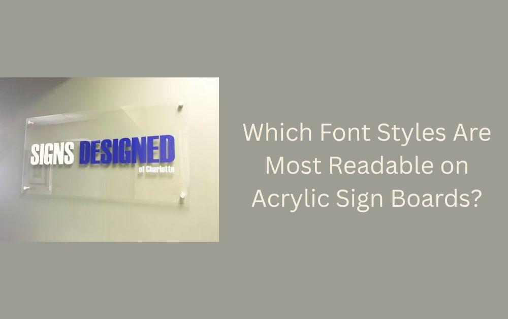
Acrylic sign boards are one of the most popular choices for businesses, offices, and stores. They are durable, look modern, and can be customized in many ways. One important factor that often gets overlooked is font style. The font you choose for your acrylic sign board can make a huge difference in how easy it is to read, how professional it looks, and how well it communicates your message.
In this article, we will guide you through the most readable font styles for acrylic sign boards, tips to choose the right font, and how to make your signs stand out.
Why Font Style Matters on Acrylic Sign Boards
First Impressions Count
When someone sees your acrylic sign board, they form an opinion about your business within seconds. A clean and easy-to-read font creates a professional impression. On the other hand, a fancy or complicated font can confuse people and make them ignore your message.
Readability is Key
The main purpose of any sign board is to convey information. If people cannot read it quickly, your sign board fails its purpose. Readable fonts help your customers understand your message at a glance.
Fonts Influence Brand Image
Fonts are not just letters; they carry personality. A bold, modern font can make your business look innovative. A classic font can give a sense of trust and reliability. Choosing the right font aligns your sign board with your brand identity.

Types of Fonts for Acrylic Sign Boards
There are many font styles available, but not all of them are suitable for acrylic sign boards. Here are the most common types that work best:
Sans-Serif Fonts
Sans-serif fonts are clean and simple. They do not have extra strokes at the ends of letters, which makes them very easy to read from a distance. Examples include:
- Arial
- Helvetica
- Verdana
These fonts are perfect for both indoor and outdoor acrylic sign boards. They look modern and professional.
Serif Fonts
Serif fonts have small lines or strokes at the ends of letters. They are traditional and elegant, making them suitable for corporate offices or luxury stores. Examples include:
- Times New Roman
- Georgia
- Garamond
Serif fonts are better for medium to large sign boards where people have enough time to read.
Script Fonts
Script fonts look like handwriting. They can be stylish and decorative, but they are harder to read. Use them only for short text, like a brand name or logo, and avoid long messages. Examples include:
- Brush Script
- Pacifico
- Dancing Script
Display Fonts
Display fonts are bold and unique, designed to catch attention. They are best for headings, but not for long messages. Examples include:
- Impact
- Bebas Neue
- Futura Bold
Top 7 Tips to Choose the Most Readable Font for Acrylic Sign Boards
Choosing the right font is not just about style. Here are practical tips to make sure your sign board is readable and attractive.
1. Keep It Simple
Avoid using too many fancy fonts. Simple fonts are easier to read and look professional. Stick to one or two font styles for a single sign board.
2. Consider Font Size
The size of the font matters as much as the style. Make sure your letters are large enough to be read from the distance your customers will view the sign. For outdoor signs, bigger is always better.
3. Use High Contrast Colors
Font color should contrast with the acrylic background. For example, black letters on a white acrylic board are very readable. Bright colors can also work, but make sure the text stands out.
4. Avoid Thin or Light Fonts
Thin fonts may look elegant, but they can be hard to read on acrylic, especially under sunlight or low lighting. Bold or medium-weight fonts are the safest choice.
5. Limit All Caps Text
Using all capital letters can reduce readability. Reserve all caps for short words or headings. For longer messages, mix upper and lower case letters.
6. Test for Distance
Check how your font looks from different distances. People should be able to read it clearly from the farthest point you expect them to view the sign.
7. Match Your Brand Style
Your font should reflect your brand personality. A fun font suits a creative business, while a clean and modern font works for a professional office. Matching font style with brand image helps in recognition.
How Font Style Affects Acrylic Sign Board Design
Improves Readability
Choosing the right font improves how quickly people can read your sign. This is very important for outdoor signs, store entrances, and busy streets where people are passing by quickly.
Enhances Aesthetic Appeal
A good font can make your acrylic sign board visually appealing. It adds to the design and makes your board look high-quality.
Creates Brand Consistency
Using consistent fonts across all your sign boards, websites, and marketing material helps in creating a strong brand image. People start recognizing your style easily.
Mistakes to Avoid When Choosing Fonts
Even small mistakes in font selection can reduce the effectiveness of your sign board.
Using Too Many Fonts
Multiple fonts on one board create confusion. Stick to a maximum of two font styles.
Overly Decorative Fonts
Fonts with excessive swirls or ornaments look pretty but are hard to read. Use decorative fonts only for short text.
Ignoring Lighting Conditions
Fonts may look good indoors but can be unreadable under sunlight or in dim lighting. Always test your acrylic sign board in real conditions.
Popular Font Combinations for Acrylic Sign Boards
Combining fonts can make your sign board more dynamic if done correctly. Here are some safe combinations:
- Helvetica + Georgia: Modern and professional
- Arial + Times New Roman: Simple and elegant
- Bebas Neue + Open Sans: Bold headline with readable body text
Always make sure that the combination does not make your sign look busy.
How to Test Font Readability
Step 1: Print a Sample
Print a small version of your acrylic sign with the chosen font. Check how it looks at different angles and distances.
Step 2: Ask for Feedback
Show the sample to friends or colleagues. Ask them if they can read it easily.
Step 3: Adjust Size and Weight
If your test readers find it hard to read, increase the font size or choose a bolder weight.
Step 4: Consider Acrylic Reflection
Acrylic surfaces can reflect light. Make sure your font color and thickness reduce glare and remain readable.
Conclusion
Choosing the most readable font for acrylic sign boards is essential for clear communication and professional appearance. Sans-serif fonts like Arial, Helvetica, and Verdana are the safest choices for most signs. Serif fonts add elegance, while script and display fonts can be used selectively for brand names or headings.
Remember to:
- Keep fonts simple and large
- Use contrasting colors
- Test visibility from different distances
- Match the font with your brand personality
A well-chosen font improves readability, enhances design, and strengthens your brand image. By following these tips, your acrylic sign board will not only look attractive but also communicate your message effectively to everyone.