

Typography plays a vital role in how we read and understand text, especially on products like personalized cups. It affects how readable, attractive, and impactful the message or brand name appears. For businesses and individuals who invest in custom designs, understanding how fonts and styles influence legibility is essential. In this article, we explore how typography directly shapes the effectiveness of personalized cups.
Why Typography Matters in Personalized Designs
Typography is more than just choosing a fancy font. It’s about how text looks and feels. In the case of personalized cups, the design must be visually pleasing but also easy to read. Poor typography can ruin a message, even if the design is colorful or creative.
Legibility is the biggest concern when designing cups. Unlike other products, cups are often viewed in motion or from different angles. If the text is hard to read, the purpose of the customization is lost. Fonts that are too thin, too curly, or too cramped can make the text unreadable.
Cups are also used in various settings—parties, coffee shops, corporate events, and weddings. Each setting has its own needs. A wedding cup may use a fancy script font, while a coffee shop cup needs a clean and modern look. The right typography ensures the message fits the occasion.
Personalized cups are often ordered for marketing purposes too. A business may print its logo, slogan, or website on a cup. If customers can’t read it quickly, the marketing fails. That’s why brands should think deeply about typography before printing.
Font Size and Its Impact on Readability
Font size directly affects how people see and process information on a cup. When text is too small, it becomes hard to read, especially when the cup is moving or viewed from a distance. On the other hand, fonts that are too large may dominate the design and reduce its appeal.
A well-balanced font size allows people to read the message without effort. For example, a customer name printed on a cup should be large enough to catch the eye but not so big that it overshadows the design. It’s all about proportion.
Another point to consider is the shape of the cup. A tall, narrow cup offers less space for text than a wide, flat cup. Designers must adjust the font size according to the cup’s shape. If not, the text may wrap awkwardly, breaking words and reducing clarity.
Material also matters. Some cups are made of plastic, others of paper, and some are ceramic. A small font may look fine on a glossy ceramic cup but blur on a paper cup. The surface texture can influence how clear the printed text appears.
The ideal font size also depends on the type of text. A headline or brand name should be more prominent. Supporting text, like event dates or hashtags, can be smaller. The contrast helps readers know what to focus on first.
How Businesses Can Use Typography to Strengthen Branding
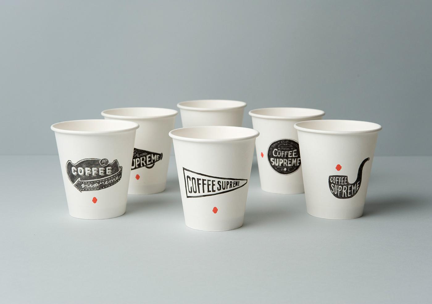
Typography is a powerful branding tool. On customized cups, the right typeface can make your brand stand out and stay in people’s minds. Many businesses underestimate this simple but effective method.
Using a consistent font across all branded materials builds visual identity. When your cup design matches your website, logo, and packaging, it strengthens trust. Customers begin to recognize your brand instantly.
Typography also tells your story. A bold, geometric font says your brand is modern. A handwritten one suggests friendliness and warmth. These subtle cues affect how people feel about your business.
Good typography also drives action. A clear font with enough contrast and the right size can guide customers to visit your website, follow your socials, or remember your slogan. One of the best examples can be seen in how https://ibexpackaging.com/custom-cups/ uses typography across its products—keeping it clean, clear, and on-brand, which makes every design stand out.
Choosing the Right Font Style for Your Audience
Font style carries emotional weight. It tells people how to feel about the message. A bold sans-serif font may suggest modernity and confidence. A cursive font may feel romantic or personal. Choosing the right style depends on who the cup is meant for.
For children’s events, playful fonts work best. These often have rounded edges and bright colors. They are easy to read and fun to look at. For corporate events, clean and formal fonts make more sense. They show professionalism and trust.
Weddings often use script or calligraphy fonts. These offer elegance and a touch of tradition. But script fonts can be hard to read if not chosen carefully. A script font with too many curls or swirls may confuse readers. It’s important to strike a balance.
Font weight is also part of style. Thin fonts may look elegant, but they are harder to read from a distance. A medium or bold weight makes the text stand out more. It improves visibility and ensures the message doesn’t get lost.
Brands must also stay consistent with their identity. If a brand uses a specific font on its website or product packaging, that font should be used on its cups too. This keeps the visual identity strong and memorable.
Importance of Contrast in Typography
Contrast refers to the difference between the text color and the background. It’s one of the most important parts of legibility. Without good contrast, even the best-designed text becomes unreadable.
On cups, contrast becomes more important due to the variety of lighting conditions. A cup may be used in dim indoor lighting or bright outdoor settings. If the text blends into the background, people won’t be able to read it.
Dark text on a light cup works well. So does white text on a dark cup. But issues arise when designers use light colors together. For example, yellow text on a white cup is hard to see. The same goes for red text on a dark brown background.
Some printing methods also affect contrast. Glossy finishes can create glare. Matte finishes absorb light and may improve readability. Knowing how the final product will be used helps in making these decisions.
Designers also play with contrast using font weight and spacing. A bold font with more spacing stands out better than a thin font packed tightly. These small changes can make a big difference in how readable the text is.
How Spacing Affects Text Clarity
Spacing refers to the distance between letters (tracking), between lines (leading), and even between words. On custom cups, where space is limited, proper spacing becomes essential.
If letters are too close, they blend together. This makes words hard to recognize. If they are too far apart, reading feels broken. The balance of spacing is what keeps the design neat and readable.
Line spacing matters for multi-line messages. Wedding cups may include names, dates, and a short message. If the lines are too close, the text feels cramped. Good spacing makes each line stand out clearly.
Word spacing is also key when printing names or slogans. Words that are too close can look like one long word. This confuses readers and breaks the flow. Proper spacing helps guide the eye naturally.
Cups also curve. This curve changes how we see space. Letters near the edge of a cup may look tighter or wider than those in the center. Skilled designers adjust spacing to account for this curve. This ensures the text looks even all around.
Typography Trends in Cup Personalization
Typography trends change every year. What looked fresh last year may feel outdated now. For personalized cups, staying updated with current trends helps create designs that feel modern and engaging.
One popular trend is minimalist fonts. These are clean, sans-serif fonts with simple lines. They look sleek and are easy to read. They are great for corporate events or trendy coffee shops.
Another trend is using mixed typography. This means combining two or more fonts in one design. For example, a bold font for a name and a script font for a message. This contrast draws attention and adds interest. It also helps separate different parts of the message.
Retro fonts are also making a comeback. These fonts bring a nostalgic feel. They work well for vintage-themed parties or retro cafés. They create a strong emotional connection with the audience.
Handwritten fonts are still popular. They give a personal touch, perfect for gifts or weddings. But these must be chosen carefully. Some handwritten fonts are hard to read. Choose one that is both stylish and legible.
Common Typography Mistakes to Avoid
Many design issues on custom cups come from common typography mistakes. These can reduce readability and hurt the overall appearance. Knowing what to avoid can save time, money, and frustration.
- Too many fonts: Using several fonts in one design can make the cup look messy. Stick to one or two complementary fonts.
- Over-styling text: Bold, italics, underlines, and shadows all at once? It’s too much. Use styling tools sparingly.
- Ignoring cup shape: Flat designs may not translate well to a curved surface. Always test on a mockup.
- Poor alignment: Text that isn’t centered or aligned properly looks unprofessional. Align content to guide the reader’s eye.
- Choosing style over readability: Fancy fonts may look cool but are often hard to read. Always prioritize clarity.
Avoiding these mistakes ensures that your personalized cups look professional and are easy to understand. They reflect well on both personal events and business branding.
Conclusion
Typography is more than decoration—it’s a functional part of design that influences how we read and feel. On personalized cups, it becomes even more important. It must suit the message, match the event, and stay readable in various settings. By understanding and applying key typography principles—font size, spacing, contrast, style, and trends—you can ensure your custom cups leave a lasting impression. Whether you're designing for a wedding, a business, or a personal gift, great typography is the key to success.